
The opposite color of purple is yellow. Purple and yellow are complementary colors that sit opposite each other on the color spectrum.
This means that they create a vibrant contrast when used together. In the world of color theory, purple and yellow are considered contrasting colors, making them a perfect pairing for creating visual interest and balance. The bright and warm tones of yellow complement the cool and deep tones of purple, resulting in a visually striking combination.
Whether used in art, design, or fashion, the combination of purple and yellow can add a dynamic and eye-catching element to any composition.
The Color Wheel And Purple’s Position
Purple’s opposite color on the color wheel is yellow. These two colors are positioned directly across from each other, creating a vibrant contrast.
Understanding the color wheel and the position of purple within it is essential for comprehending its opposite color. The color wheel is a visual representation of the relationships between colors. It is divided into primary, secondary, and tertiary colors, with each color having a specific place on the spectrum.
The Basics Of Color Theory
Color theory is the study of how colors interact and harmonize with each other. It helps us understand the principles of color mixing and the emotional impact that colors can have. The color wheel is a fundamental tool in color theory, providing a visual guide to the relationships between colors.
There are three primary colors: red, blue, and yellow. These colors cannot be created by mixing other colors together. By combining two primary colors, we get secondary colors: orange, green, and purple. Tertiary colors are created by mixing a primary color with a secondary color.
Purple On The Color Spectrum
Purple is considered a secondary color because it is created by combining the primary colors blue and red. It sits between blue and red on the color wheel, representing a perfect balance between the coolness of blue and the warmth of red.
When it comes to identifying the opposite color of purple, we need to look at its complementary color on the color wheel. The complementary color of purple is yellow. This means that yellow is positioned directly across from purple on the color spectrum.
The concept of complementary colors is crucial in color theory. Complementary colors create a striking contrast when placed together, making each color appear more vibrant and intensifying the visual impact.
Knowing the complementary color of purple opens up a world of possibilities for creating harmonious color combinations. If you want to create a bold and eye-catching design, pairing purple with its complementary color, yellow, will create an intense and visually appealing contrast.
Additionally, purple also has other opposite colors on the color wheel, known as split-complementary colors. These colors are found on either side of its direct complement, yellow. In the case of purple, its split-complementary colors are green-yellow and sky blue. These colors offer alternative options for creating color schemes that are both harmonious and visually engaging.
Understanding the position of purple on the color spectrum and its relationship with complementary and split-complementary colors allows us to explore endless possibilities in design, art, and aesthetics. By using the principles of color theory, we can create visually striking compositions that captivate and engage the viewer.
Complementary Colors Explained
Purple’s complementary color is yellow, as it sits opposite yellow on the color spectrum. This means that citrus shades like lemon yellow or bright yellow are the perfect contrasting color for purple. Understanding complementary colors can help you create a balanced and vibrant color scheme in your designs.
Defining Complementary Colors
Complementary colors are pairs of colors that are positioned opposite each other on the color wheel. When combined, they create a strong contrast and enhance each other’s vibrancy. In the case of purple, its complementary color is yellow. This means that yellow is the perfect color to balance and contrast with purple.
The Role Of Contrast
Contrast plays a crucial role in design and visual aesthetics. When complementary colors are used together, they create a dynamic and eye-catching effect. Purple and yellow, being complementary colors, offer a high-contrast combination that is both bold and visually appealing.
Imagine a painting or a room where purple and yellow are used strategically. The purple elements will stand out against the yellow background, creating a captivating and harmonious composition.
By understanding complementary colors, designers and artists can create visually pleasing and well-balanced color schemes that grab attention and evoke emotions.
Purple’s Complementary Color
Purple’s complementary color is yellow, as it sits opposite yellow on the color spectrum. This creates a perfect balancing contrast, making citrus shades the ideal complement to purple.
The opposite of purple on the color wheel is yellow, making it purple’s complementary color. Yellow serves as the perfect contrast to purple, creating a vibrant and balanced color scheme.
Yellow: The Perfect Contrast
Yellow is the perfect contrasting color to purple. It creates a striking visual impact when paired with purple, making the combination visually appealing and attention-grabbing.
Variations Of Yellow As Opposites
When considering the opposite of purple, various shades of yellow can serve as effective complements. From bright citrus tones to softer pastel yellows, each variation brings its own unique contrast to purple, allowing for versatile and dynamic color pairings.
Color Perception And Opposites
Understanding color perception and the concept of opposites in the color spectrum is essential in art, design, and even psychology. The way we perceive colors and their opposites is influenced by both biological and psychological factors.
How We Perceive Complementary Colors
Complementary colors are pairs of colors that, when combined, cancel each other out. They create a neutral gray or white when mixed together. In the traditional color wheel, the opposite of purple is yellow. When placed side by side, complementary colors intensify each other, creating a vibrant visual impact.
Psychology Of Purple And Its Opposite
Purple is often associated with royalty, luxury, and creativity. Its complementary color, yellow, provides a striking contrast that can evoke feelings of energy, warmth, and optimism. The psychological impact of these complementary colors varies based on cultural and individual associations.
Color Harmonies Involving Purple
Purple’s opposite color on the color wheel is yellow. As complementary colors, purple and yellow create a vibrant contrast that brings balance and harmony to any color scheme.
Color Harmonies Involving Purple Purple is a color that has long been associated with royalty, luxury, and power. It is a versatile color that can be used in a variety of design schemes, from traditional to modern. When it comes to color harmonies involving purple, there are two main schemes to consider: analogous and triadic. Analogous Scheme Analogous color schemes involve using colors that are adjacent to each other on the color wheel. In the case of purple, this would include shades of blue and red. An analogous color scheme using purple might include shades of lavender, periwinkle, and magenta. This creates a harmonious and calming effect, as the colors blend seamlessly together. Triadic Scheme Triadic color schemes involve using colors that are evenly spaced apart on the color wheel. In the case of purple, this would include shades of green and orange. A triadic color scheme using purple might include shades of olive, tangerine, and violet. This creates a more vibrant and bold effect, as the colors contrast with each other. Using Purple in Design Purple is a versatile color that can be used in a variety of design applications. It can be used as a primary color or as an accent color to add depth and dimension to a design. When using purple in design, it is important to consider the mood and tone that you want to convey. For a more calming and soothing effect, consider using shades of lavender and periwinkle in a bedroom or spa setting. For a more bold and vibrant effect, consider using shades of magenta and violet in a fashion or advertising campaign. In conclusion, when it comes to color harmonies involving purple, there are two main schemes to consider: analogous and triadic. Whether you are using purple as a primary or accent color in your design, it is important to consider the mood and tone you want to convey to your audience.
Credit: drawingsof.com
Mixing Colors: Purple’s Complementarity
Purple’s complementary color is yellow, as they sit opposite each other on the color spectrum. This creates a vibrant contrast, making citrus shades the perfect complement to purple.
Mixing Paints To Find Opposites
When it comes to mixing paints, finding the opposite of a color can be a bit tricky. In the case of purple, its complementary color is yellow. This means that mixing purple paint with yellow paint will result in a neutral gray or brown color, depending on the ratio of each color used. To create a more vibrant contrast, you can mix purple paint with a brighter shade of yellow. For example, mixing purple with lemon yellow will create a bold and eye-catching color combination.Digital Color Mixing
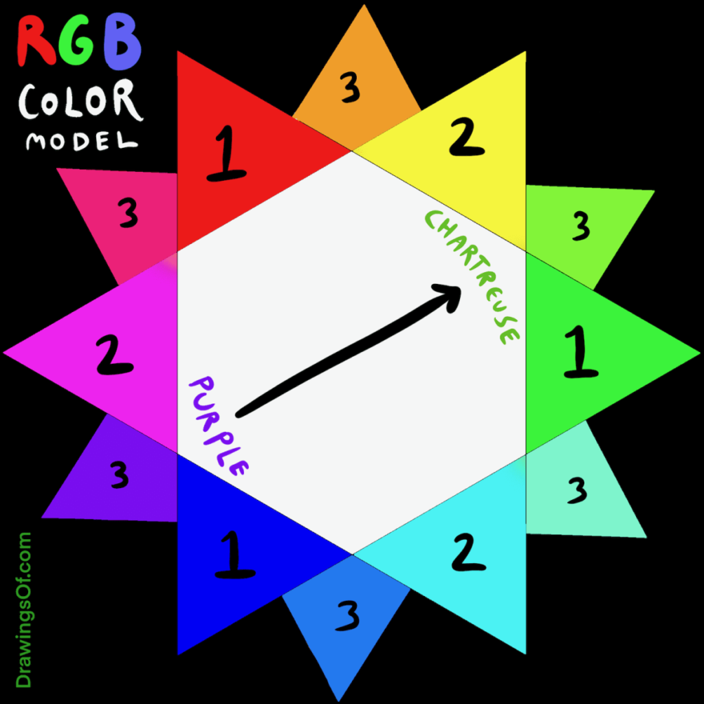
In the digital world, color mixing is a bit different. To find the opposite of purple, you can use color theory and the RGB color model. Purple is created by mixing blue and red light, so its opposite color is created by mixing green and red light. This means that the opposite of purple in the digital world is a shade of green. When designing a website or graphic, using complementary colors can create a visually appealing and balanced design. Combining purple with its opposite color, green, can create a striking and harmonious color palette. In conclusion, understanding color theory and complementarity can help you mix colors and create visually appealing designs. Mixing purple paint with yellow or using green as the opposite color in digital design can create a beautiful and eye-catching color combination.Impact Of Lighting On Perceived Opposites
When it comes to the perception of color opposites, lighting plays a crucial role in altering our visual experiences. The impact of lighting, whether natural or artificial, can significantly influence how we perceive the opposites of colors, such as purple. Understanding the effects of lighting is essential in various fields, including art, design, and photography.
Natural Vs. Artificial Light Effects
Natural light, with its full spectrum of colors, can enhance the vibrancy and clarity of color perception. The subtle shifts in natural light throughout the day can influence how we perceive color opposites. On the other hand, artificial lighting, such as incandescent or fluorescent light, may cast different color temperatures, affecting the way we interpret color relationships.
Color Opposites In Photography
In photography, the interplay between natural and artificial light can create captivating contrasts and reveal the true nature of color opposites. Photographers often manipulate lighting conditions to accentuate the complementary nature of colors, showcasing the dynamic interplay between opposites like purple and yellow. By understanding how different lighting sources interact with colors, photographers can create visually compelling compositions that highlight the concept of color opposites.

Credit: graphicdesign.stackexchange.com
Practical Applications In Art And Design
In the world of color theory, the opposite of purple is yellow. These two colors are positioned directly across from each other on the color wheel, creating a vibrant contrast. This makes yellow the complementary color to purple in art and design.
Choosing Complementary Colors For Impact
When it comes to practical applications in art and design, understanding the concept of complementary colors is essential. In color theory, the opposite of purple is yellow. This means that when these two colors are used together, they create a high-contrast and visually impactful combination.
Examples In Branding And Advertising
In branding and advertising, the use of complementary colors can significantly impact the visual appeal and memorability of a brand. For instance, consider the iconic combination of purple and yellow in the branding of companies like Yahoo and Taco Bell. The strategic use of these complementary colors not only creates a visually striking presence but also communicates a sense of vibrancy and energy.
Beyond Aesthetics: Opposite Colors In Nature
Purple’s opposite color is yellow, as they are positioned directly across from each other on the color wheel. This makes citrus shades an excellent contrasting option for purple in nature.
When we think about colors in nature, we often associate them with aesthetics and beauty. However, colors in nature serve a much deeper purpose than just visual appeal. The concept of opposite colors, or complementary colors, plays a significant role in the biological world. Understanding the biological significance of color contrasts can shed light on the intricate relationships between different species and their environments.
Biological Significance Of Color Contrasts
In the natural world, colors play a crucial role in communication, camouflage, and warning signals. The use of opposite colors, or color contrasts, can have various biological implications for different organisms. Here are a few examples:
- Camouflage: Many species use color contrasts to blend in with their surroundings and avoid predators. For instance, the vibrant green color of some insects contrasts with the red or purple hues of the flowers they inhabit, making them less visible to predators.
- Warning Signals: Opposite colors can also serve as warning signals in nature. Brightly colored patterns, such as the yellow and black stripes of a wasp or a bee, signal to potential predators that they are venomous or dangerous.
- Attracting Pollinators: Flowers often display opposite colors to attract specific pollinators. For example, purple flowers, with their opposite color of yellow, are known to attract bees and butterflies, which play a vital role in pollination.
Color Opposites In Flora And Fauna
The presence of opposite colors can be observed in both flora and fauna, highlighting the diverse strategies organisms have evolved to survive and thrive. Here are a few examples of color opposites in nature:
| Organism | Opposite Colors |
|---|---|
| Flowers | Purple and yellow |
| Butterflies | Black and white |
| Birds | Red and green |
| Frogs | Green and red |
These examples illustrate how opposite colors are utilized across different species to fulfill various biological functions.
In conclusion, colors in nature go beyond aesthetics and serve important biological purposes. Opposite colors, or color contrasts, play a crucial role in communication, camouflage, and attracting pollinators. By understanding the biological significance of color opposites, we gain a deeper appreciation for the intricate relationships between organisms and their environments.

Credit: graphicdesign.stackexchange.com
Frequently Asked Questions
What Is The Opposite Color Of Purple?
The opposite color of purple is yellow. Purple and yellow are complementary colors that sit opposite each other on the color spectrum. This creates a vibrant contrast and makes citrus shades the perfect balancing color contrast for purple.
What Is A Contrasting Color To Purple?
The contrasting color to purple is yellow. Purple and yellow are complementary colors as they sit opposite each other on the color spectrum. This creates a vibrant and balanced contrast between the two colors.
What Are The Opposites Of Colors?
The opposite of purple is yellow on the color wheel, creating a vibrant contrast. This makes citrus shades the perfect complementary colors for purple.
What Is The Opposite Color Of Lavender?
The opposite color of lavender is yellow. Lavender and yellow are complementary colors that create a vibrant contrast.
Conclusion
The opposite of purple is yellow, as per color theory. These complementary colors create a vibrant contrast and balance each other perfectly. Understanding color combinations and contrasts can add depth and visual appeal to designs and aesthetics. Embracing the interplay of colors can elevate artistic and design endeavors.